( Malaysia No.1 SEO Web Design Company )
Top
responsive

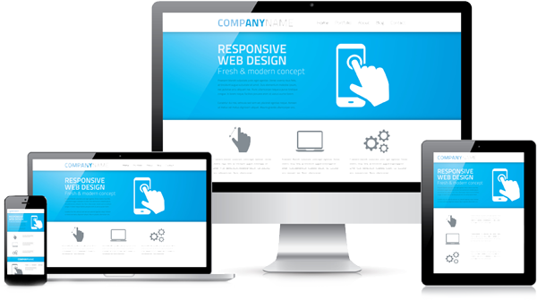
Responsive (Mobile-friendly) Web Design

In the last decade, we have built many successful outstanding mobile websites. Check out some of our work. You will be impressed. We would love to help you own an outstanding mobile responsive website too. Get started.

Why You Need a Mobile-Friendly Website?

First impression really count. Mobile is everywhere! Based on that first few seconds of good impression, visitors will decide they have the trust and confidence to stay and connect with you.

  • #1 First impressions count!

    Most people just skim over a website. An impressive and outstanding website will make them stay on the website. Therefore, the likelihood of them connecting with you is higher.

  • #2 Be found on Google?

    If you are not ranked among the Google Top 10, you will lose a lot of potential clients, especially mobile users.

  • #3 Mobiles are the future!

    If your website cannot fit well in a smartphone screen, you will definitely miss a lot of potential clients.

  • #4 Your website go global!

    Potential clients browse through the internet anytime and anywhere. Make sure your website (especially if it is an e-commerce website) is always up and kept updated all the time.

  • #5 Easy update anytime, anywhere!

    You must always keep your websites fresh to enhance your corporate image. This builds customer trust.

  • #6 People love to share…

    Your website must be easily linked to social media such as Google+, Facebook, Twitter and WhatsApp.

responsive-web-design

Mobile Web Design Features

Fully Responsive (Mobile Friendly)

Our responsive web designs fit well with ALL screen sizes including those of the iPhone, iPad, tablets, PCs among others.

Get on Google (Search, Maps, Google+)

Google My Business connects you directly with customers across Google such as Google Maps or Google+

CMS Ready (WordPress)

Update web news and events anytime and anywhere.

Google Analytics

Get insights into your website and know the details of your user behavior and more.

SEO Friendly (Google, Yahoo, Bing)

Google easily reads through web content and index for better ranking.

Social Media Sharing

Easy to share on Facebook, Twitter , G+. etc

Mobile Web Design Process

Grow your business with the help of a trusted online expert. Search from over 5,000 Google Partners to find the right one for your business.

1. Meeting

Explore project goals, requirements, time lines and budget allocation.

2. Design & Development

Prepare web mock demos, revision and final design confirmation. Proceed with actual html and programming.

3. Golive & Support

After User Testing and reviews, website Golive officially. Web support and maintenance follow.
We always welcome new partners. Tell us about yourself and how we could assist ?
Let's have a cup of coffee together, shall we ?
Follow Us
CONTACT US